부산시 공원 안내시설물 표준디자인
공공디자인_PUBLIC DESIGN
CLIENT l 부산시설공단
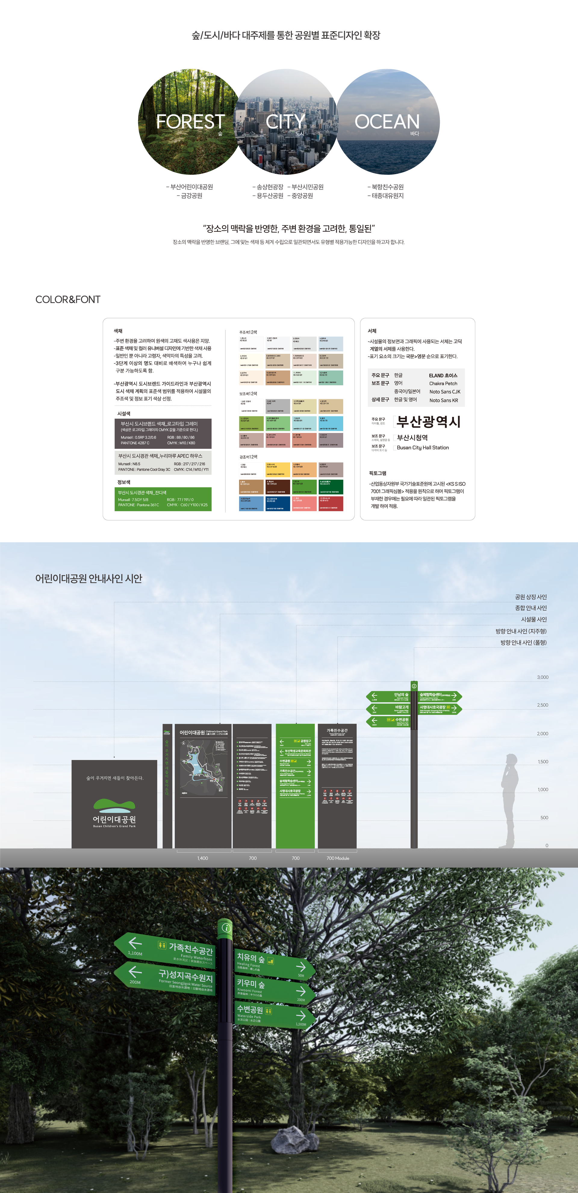
어린이대공원 안내시설물 디자인 및 표준디자인을 진행하였다. 부산시 공원의 이용 환경을 개선하고, 각 공원의 특성을 유지하면서 부산시 공원의 통합된 정체성을 구축하기 위해 개발되었다.
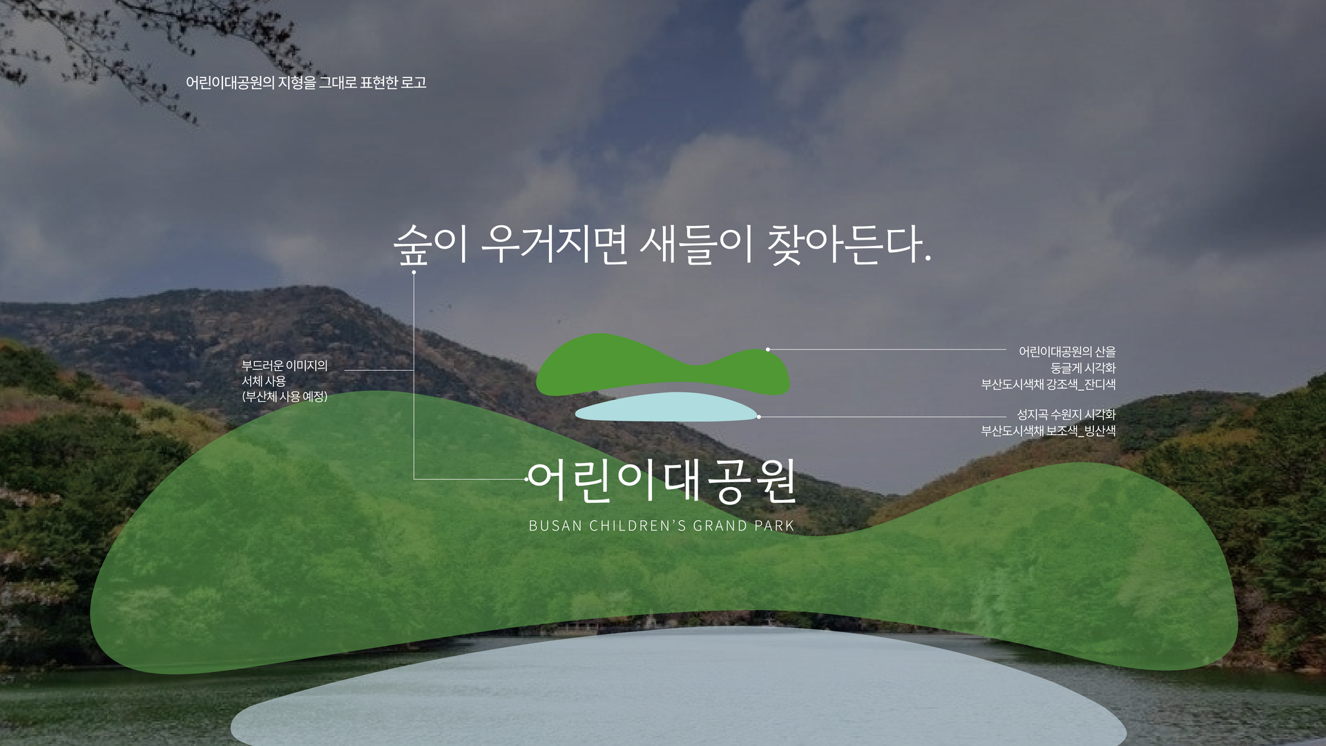
부산의 다양한 공원을 입지와 경관 특성에 따라 숲·도시·바다의 세 가지 유형으로 구분하고, 각 유형의 자연환경과 장소성을 반영한 색채 및 디자인 컨셉을 수립하였다. 공원 이용자의 이동 동선을 분석하여 진입부터 주요 시설 이용까지 전 과정에서 직관적인 정보 전달이 가능하도록 표준화된 사인 시스템을 적용하였다. 공원의 지형과 대표 경관을 시각화한 상징체계를 중심으로 색채·서체·픽토그램·정보 위계를 체계화하여 시설 간 일관성을 확보하였으며, 공원 상징사인부터 종합안내·시설안내·방향안내사인까지 기능별 체계를 구축하였다. 유니버설 디자인과 안전서비스 디자인을 바탕으로 높은 시인성의 색채와 국제 기준에 기반한 다국어 표기 및 픽토그램을 적용하여, 연령과 국적에 관계없이 누구나 쉽고 편리하게 이용할 수 있는 공원 환경을 구현하였다.
The information facilities and standardized signage system for Busan Children’s Grand Park were developed to improve the overall visitor experience while establishing a unified identity across Busan’s public parks without compromising the unique character of each location.
Busan’s parks were categorized into three types—forest, city, and ocean—based on their location and landscape characteristics. Distinct color schemes and design concepts were then developed to reflect the natural environment and sense of place associated with each type. By analyzing visitor circulation, a standardized signage system was established to deliver intuitive information throughout the entire journey, from park entry to major facilities. A consistent visual identity was created by systematizing colors, typography, pictograms, and information hierarchy around symbols inspired by each park’s topography and representative landscape. This system was applied across park identity signs, orientation maps, facility signs, and directional signage. Based on universal design and safety service design principles, the system incorporates highly visible colors, multilingual information, and internationally recognized pictograms, creating an accessible and convenient park environment for visitors of all ages and nationalities.